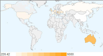
The first heat map is based on the number of golds won by each country:

As you can see when you look purely at the number of gold medals won by each country China and the USA are a long way ahead of the rest of the field.
However things change very quickly when you look at the number of gold medals divided by a country's population.
This heat map is based on the number of gold medals divided by the country's population:

When you look at gold medals as a percentage of population China suddenly is bottom and the USA 12th of the 15. Slovakia followed by Australia and then Great Britain now head the table.
Finally this heat map is based on the number of gold medals divided by the country's GDP:

When we look at the gold medals divided by a country's GDP China jumps up the table again, coming third behind the Ukraine in first place and Romania in second. The USA comes in 12th of of the fifteen countries when you examine the tables in this way.
If Michael Phelps were a country he would currently lie joint sixth in the gold medal table and top the population table. I don't know Phelps' GDP but fully support the idea of him becoming a country in his own right.
The data for the gold medals was taken at around 11am GMT 17th August. The population and GDP data was taken from Wikipedia.
Update:
Ouseful has created a Google Spreadsheet of the medal table using a ‘live’ feed for the data. The table includes four heat maps for gold, silver, bronze and total medals.
________________
0 comments:
Post a Comment