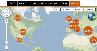
iSpirit have decided to mark the opening of the G20 summit in London with this map of the rise in unemployment in G20 countries since July of 2007 until the first quarter of 2009.
For each country it is possible to see, at a glance, the percentage rise in unemployment and the global map illustrates the massive scope of the current world economic crisis.
You can view statistics for each quarter via the tabs at the top of the map. Most of the data is sourced from the annual World Employment report recently published by the International Labour Office. The latest updates are sourced from national agencies.
_________________
0 comments:
Post a Comment