Blog Archive

Showing posts with label New York. Show all posts

Tuesday, June 12, 2012

Carmelo Anthony's Life on Google Maps


The Melo Express was created to celebrate the life and career of basketball player Carmelo Anthony and, coincidentally, to sell a few pairs of Jordan Melos.

The application features a styled Google Map of New York with a number of videos in which Melo talks about his life and basketball playing career. The map also functions as a neat store locator. Dotted around the map are locations in New York where you can purchase Nike's basketball range of footwear.

The use of the Google Maps Styled Maps function is pretty effective in this map, especially if you zoom right in on the map. The Google Maps 3d buildings look particularly striking in this chosen color scheme.

Saturday, June 9, 2012

The Hip Hop Map Guide to New York


ARTE - New York Minute: a Hip Hop Guide is an interactive typographic map guide to the history of hip hop in New York.

Anyone can contribute a story to the map by registering with arte.tv. The stories can be accessed by clicking on the orange map markers on the map. Each story includes a Google Map or Google Map Street View of the relevant location.

The map has been developed to accompany a six part mini-series A New York Minute. You can watch each episode of A New York Minute on the arte.tv website.

Wednesday, May 16, 2012

Silicon Alley & Roundabout on Google Maps


Made in NY is a Google Map of New York's digital industry. The map shows the locations of over 500 homegrown startups, investors and coworking spaces across the city.

It is possible to refine the companies shown on the map by 'Digital Companies', 'Investors' and 'Coworking / Incubator Spaces'. As well as their locations being displayed on the map the companies are also listed in the map sidebar.

If you are currently looking for work in New York's tech industry then check out the companies listed in the sidebar. Those companies that currently have positions available are indicated with a 'We are hiring' link.


Tech City Map is a visually striking Google Map of the technology companies and startups in east London.

The map shows the locations of London's silicon roundabout area. The 'show networks' option on the map allows users to visualise the connections between the over 800 companies. If you click on an individual map marker there is also an option to view the latest Tweets from the selected tech company.

Monday, April 30, 2012

A Google Maps New York Special


Uncivil Servants is a crowd-sourced Google Map of illegal parking incidents by New York city employees.

Apparently New York city civil servants  have been rampantly abusing parking permits. Uncivil Servants wants to to eliminate this parking permit abuse. Anyone can use the site to post photos of vehicles abusing parking permits and the reports will be added to the map.


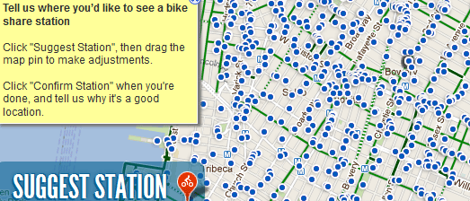
NYC DOT and Alta Bicycle Share want to establish a bike share system in New York City.

The New York City Bike Share Map is a Google Map which New Yorkers can use to suggest where bike share stations should be located.


The Jackson Heights Neighborhood Transportation Study is a Google Map of data collected by DOT as part of a Jackson Heights study.

The map shows average traffic speeds on Jackson Height's roads, pedestrian volumes and the locations of vehicle accidents in Jackson Heights.

Tuesday, March 6, 2012

Pumps About Town with Google Maps


Shoes About Town is an inspired promotional campaign from New York shoe salon Bergdorf Goodman.

The promotional campaign encourages people to take an Instagram photo and then to post it on Twitter with the hashtag #BGSHOES. The photos of the shoes then appear on a great looking custom map, created using the Google Maps API.


I suspect that the inspiration for the design of the hand-drawn type zoom controls on the Bergdorf Goodman map and the idea for the map may owe something to Mike Gleason's tutorial Create Zoomabable Images with the Google Maps API.

Mike's tutorial explains how you can create a Google Map replacing the normal Google Maps map tiles with your own image.


The promotional campaign may also have been partly inspired by Zappos, the online shoes retailer. In 2009 Zappos created a real-time map of orders placed on the Zappos website called Zappos Map.

Zappos add photographs of their product being brought in real-time on a Google Map of the United States. If you click on any of the photographs on the map then you are taken to the web page for that product (and Zappos presumably hope you will be tempted to buy the product yourself). This is a little trick that the Bergdorf Goodman map is missing at the moment.

If I was Bergdorf Goodman I would add links from the photos of their shoes on the map to the product's page on their online store,

Thursday, March 1, 2012

Not a Google Map


Very, very rarely an on-line map that doesn't use the Google Maps API is so beautiful that I have to write about it on Google Maps Mania.

This wonderful Flash built map from Envisioning Development falls into that category. The map allows users to select New York City neighborhoods and view a bar chart of the number of families in each income group displayed at the bottom of the map.


I liked this map visualisation so much that last year I tried to create something similar using the Google Maps API. My U.S. Population Map is nowhere near as accomplished as the Envisioning Development map but I think it does point towards how a similar interface could be built using the Google Maps API.

Monday, February 13, 2012

New York Restaurant Heatmaps


Concentration of American restaurants in New York

Dan K's Blog has followed up a recent post on Heatmap of Restaurants in New York with a new post on Cuisine Concentration in New York City.

The original post was interesting in showing the restaurant density in New York City. However the maps don't reveal anything too surprising - the highest density of restaurants appear to be in those areas that you would kind of expect to see high numbers of restaurants.

The Cuisine Concentration in New York City heatmaps are much more interesting to me. The maps show the concentration of American, Chinese, Japanese, Indian, Mexican, Caribbean, Korean, Spanish, Thai and Italian restaurants in the Big Apple.

It might just be me but I find it fascinating being able to view where different types of restaurants are concentrated in the city. The maps are quite useful as well. If you fancy a certain type of cuisine you can consult the heat maps to find out the areas in New York that you should visit.

Friday, January 27, 2012

Gerrymandering Shown with Google Maps


The New York World has produced an excellent Google Maps based visualisation of the Proposed New York Senate Districts.

This visualisation of the proposed rezoning works brilliantly in map form, not only because of the obvious geographic nature of creating new senate districts but because the map perfectly illustrates the disparity in the population sizes between upstate and downstate proposed districts.

The large red area to the north on the map shows that these proposed districts will each have a smaller population than the blue districts to the south of the map in New York City. In effect New York City voters will count for less than their up-state neighbors.

As The New York World states this "regional discrepancy is crucial to Republicans' efforts to preserve their narrow control of the Senate".

Thursday, January 26, 2012

MetroCard Use Visualised on Google Maps


The Wall Street Journal created this great data visualisation to show how New Yorkers are using different kinds of MetroCards on the city's public transit network.

Examining MetroCard Usage uses the Google Maps API to present how the 30-Day Unlimited, Pay Per-Ride and Senior Discount MetroCards are used throughout NYC. Heat maps are created for each card type and useful information windows point out specific locations and usage of the cards that the WSJ finds interesting.

The visualisation also presents data taken after the 12/30/2010 fare increases to examine how usage of the different MetroCards may have changed after the fare rises.

Wednesday, December 21, 2011

New York Incomes on Google Maps


NYC Income uses Google Maps with data from the Census Bureau’s American Community Survey, to show median income by location in New York.

The map displays average income levels for each New York census tract. The map shows that the highest income levels are in Manhattan. Whilst the poorest income levels can be found in the Melrose-Morrisania section of the South Bronx.

Tuesday, November 15, 2011

When Paris Becomes a Suburb of New York


As the world's population expands and urban sprawl takes over more and more rural land there will come a time when New York City encompasses the whole world.

ExtendNY - New York City Expanded allows you to type in any location in the world and find out where you would live if New York's grid pattern of streets was expanded across the globe. For example, The Eiffel Tower in Paris will sit on the corner of 64,857 St and 12,770 Ave, once Paris inevitably becomes a suburb of New York.

Wednesday, November 9, 2011

Rate New York's POPs


WNYC and the New York World want your help in rating New York City's privately owned public spaces.

A Google Map of the city's privately owned parks, plazas, atriums and fountains has been created. Each location on the map has been given a site ID. Using the ID users can complete a short form to share the features and activities available in each privately owned public space.

_____________

Tuesday, November 8, 2011

Google Maps Tells You When to Flush


27 billion gallons of untreated sewage is dumped into New York City's Harbor every year. When the sewer system is overloaded by rainfall and snow unprocessed sewage overflows into NYC waterways. This happens as often as once a week.

DontFlush.me uses Google Maps, the daily rainfall total in New York and CartoDB from Vizzuality to help advise New Yorker's when they can safely flush their toilets.

If you have an interest in all things sewage you might also be interested in Flush Tracker. This application from Domestos lets users in the UK, Ireland, South Africa and Poland view an animated track on Google Maps that follows their waste from toilet to the sewage works, sea or wherever it happens to end up.

DontFlush.me was created at EcoHack-NYC

________________

Saturday, October 29, 2011

Halloween Live - on Google Maps


Thanks to Google you can download some awesome Halloween pumpkin templates. But why stop there?

Why not dress as up as the Street View Pegman this Halloween, stick a video camera in your pocket, record people's reactions to your scary costume and put the videos on a Google Map?

That's what Mark and Brian have done. You can follow along with their Halloween antics on Google Street Boo.

________________

Friday, September 9, 2011

Sharing Your Memories of 9/11

NYT: Where I Was Map

The New York Times' 'The Reckoning' is an in depth examination of life in America and in the rest of the world on and since 9/11. The feature includes a Google Map called Where I Was.

The map allows users to add a comment to the map explaining where they were at the time of the 9/11 attacks and / or how they feel now. When browsing the submitted comments it is is possible to filter the results by mood.

The map also includes a number of quick links to zoom the map to Ground Zero, New York and to Washington.

National Geographic Channel - Remembering 9/11

The National Geographic Channel has created this Google Map to commemorate the collective presence and kindness of strangers that got many people through the unimaginable horrors they witnessed on 9/11.

On the 10th anniversary of 9/11 the National Geographic Channel is inviting everyone to rebuild this collective history of 9/11 by sharing their personal stories on this interactive Google Map.

The Remembering 9/11 Facebook app allows users to post brief accounts of their 9/11 experiences and mark their stories on the interactive map. Users are also able to explore all posted anecdotes by location and filter stories to see their friends’ stories and share comments.

The app is available worldwide in nine languages.

Hvad Lavede du Den 11

Danish broadcaster TV 2 is also interested in how Danes remember the atrocities of 9/11. They have created this Google Map to collect the memories of their viewers.

Users of the map can add where they were during the attacks and how the attacks affected them. The map also includes summaries by some of TV 2's own news correspondents.

Hat-tip: microformats.dk

________________

Tuesday, September 6, 2011

Walkability Scores with Google Maps


Walkshed is an incredible walkability map for New York and Philadelphia. Using Google Maps and OpenStreetMap Walkshed lets you calculate a personal walk score for any address in New York and Philadelphia.

Walkshed has some pretty clever algorithms working behind the scenes to help calculate the walkability scores. For example, interstates and rivers adversely effect a walk-score whilst parks have a very positive impact.

Walkshed also allows users to create an individual walkability score by defining the nearby amenities that are important to them. The map lets the user adjust the value that they place on nearby categories of amenity such as restaurants, cafes, bars, subway stops, grocery stores etc.

Also See

Walk Score

______________

Saturday, August 27, 2011

Google Maps New York Evacuation Zones


Yesterday Google released their Crisis Response 2011 Hurricane Season Google Map. Today they have created a map just for New York City: 2011 Hurricane Irene New York City.


The New York City map shows the forecasted track of Hurricane Irene as well as the evacuation zones and evacuation centers. It is also possible to view additional layers on the map showing:

  • Storm Surge Probabilities
  • The Red Cross National Shelter System
  • Cloud Imagery
  • Evacuation Routes
Via: Google LatLong


________________

New York Evacuation Zones


The New York Times' New York City Hurricane Evacuation Zones Google Map shows the three evacuation zones in New York.


The zones are based on the strength of the hurricane making landfall. New York is preparing for the threat of storm surges with the closure of the entire public transportation system.


Climate Central has created a Google Map showing the areas in lower Manhattan, New Jersey and Brooklyn that are most at risk of storm surges from Hurricane Irene.


________________

Thursday, August 25, 2011

New York Evacuation Zones on Google Maps


The New York Times' Hurricane Irene Tracking Map is probably the only map of Hurricane Irene that you will need.


This Google Map shows the projected path of the hurricane with forecasted wind speeds along the path. It is also possible to overlay the latest satellite pictures of the hurricane on top of the map.


WYNC are also using Google Maps, in their case to display New York City Evacuation Zones.


The map shows three zones in the city:

  • Zone A - with the highest risk of flooding from ANY hurricane near NYC.
  • Zone B - potential flooding from a Category 2+ hurricanes.
  • Zone C - potential flooding from a Category 3-4 hurricane hitting just south of NYC.
The map includes links to the latest official information and to WYNC's own Google Map of Hurricane Irene's projected path.


________________

Tuesday, August 23, 2011

Haarlem & Harlem on Google Maps


Haerlem.nu is a website dedicated to recording and presenting the history of Haarlem in the Netherlands. Part of the project includes a Google Map that features historical landmarks, photographs and historical notes about locations in the city.


If you sign-up as a 'mosquito' (as the natives of Haarlem call themselves) you can add your own memories, history or photos to the map. With Haerlem.nu you can even create your own map of Haarlem's history.


Via: Nederkaart


Digital Harlem is a Google Maps based portal to explore the history of New York City's Harlem neighborhood. The site uses Google Maps to present information about Harlem drawn from legal records, newspapers and other archival and published sources.


The map includes three buttons which allow you to view historical records from 1920, 1925 and 1930. The panel on the left allows you to search for events, people or places, and generate interactive web maps based on the search results.


Multiple layers of results can be displayed on the same map, and each can be toggled on and off. A series of ready-made 'feature' maps can be accessed from the panel on the right.


________________

Popular Posts