Blog Archive

Showing posts with label Styled Maps. Show all posts

Friday, June 22, 2012

Languages at Risk on Google Maps


The Endangered Languages Project is a new website from Google looking to foster an exchange of information related to languages around the world threatened with extinction.

There are currently around 7,000 languages surviving in the world but it is estimated that at least half of them will disappear entirely before the end of this century. The Endangered Languages Project uses Google Maps to show the locations where languages are at risk throughout the world.

If you click on a language listed on the map you can get further details about the language including YouTube samples of the language being spoken, references to the language in texts from Google Books and details about how many of the language's speakers survive and an assessment of the language's current vitality.

Tuesday, June 12, 2012

Carmelo Anthony's Life on Google Maps


The Melo Express was created to celebrate the life and career of basketball player Carmelo Anthony and, coincidentally, to sell a few pairs of Jordan Melos.

The application features a styled Google Map of New York with a number of videos in which Melo talks about his life and basketball playing career. The map also functions as a neat store locator. Dotted around the map are locations in New York where you can purchase Nike's basketball range of footwear.

The use of the Google Maps Styled Maps function is pretty effective in this map, especially if you zoom right in on the map. The Google Maps 3d buildings look particularly striking in this chosen color scheme.

Monday, June 11, 2012

A Google Map for the New Economy


The Global Transition to a New Economy is a Google Map designed to showcase projects around the world that are part of a new developing economy.

The 'new economy' is one that "maximizes well-being, operates within environmental limits and is capable of coping and adapting to global environmental change".  The map is crowd-sourced and invites contributions from organisations and projects that want to help build a framework to define this new economy.

The contributed projects are color-coded by category. The categories include 'citizens and communities, finance, currencies and local economies. 

Wednesday, June 6, 2012

London Calling on Google Maps


With the summer Olympics and the Queen's Golden Jubilee being held this year, London is expecting a lot of visitors this summer. BBC Australia has created a great looking Google Map to help those visitors explore the English capital.

London Calling is a great way to find things to see and do in London and whilst you explore the map there are even opportunities to win prizes. Australian and New Zealand residents can complete challenges as they use the map for the chance to win a $4000 travel voucher and a brand new iPad.

The map as well as providing a great guide to London also looks great as well. The map uses the Styled Maps feature to give the map tiles a nice sepia tone. The information windows are also very unique. They include a circular smaller map to give the illusion of a cut-out in the window to highlight the location of the map marker beneath the window.

Via: The Google Geo Developers Blog

Friday, June 1, 2012

The Inaugural Data Journalism Awards


Pedestrian Crashes in Novosibirsk is one of the six winners of the inaugural Data Journalism Awards.

Pedestrian Crashes in Novosibirsk uses the Google Maps API to map and analyse pedestrian road accidents in Novosibirsk, Russia in 2011. The jury of the award said that the map is a,

"good interactive visualisation of what can be very dry data, with intuitive navigation, in an interface that invites readers to engage with the information. The pre-packaged pullout ‘stories’ also efficiently relay information at a glance – while allowing readers to zoom in to get customised or personal detail."

The slide control above the map can be used to filter the results shown by month. The 'pullout' stories allow the user to explore the data by gender of the driver, gender of the pedestrian, age of driver and pedestrian, and to show those accidents that caused a fatality.

Friday, May 18, 2012

Toxic Waters on Google Maps


The New York Times Water Pollution Map is a Google Map of over 200,000 facilities in the U.S. which have permits to discharge pollutants.

Users can search the map by state. Each state map shows at a glance all the polluting facilities. The blue markers on the map indicate facilities that have not violated their permits and the orange markers show the facilities that have one or more violations.

If you click on a map marker details about the selected facility are displayed beneath the map, including information about violations, fines charged and enforcement actions.

Monday, May 14, 2012

The Eurozone Crisis on Google Maps


In Spain the unemployment rate is a staggering 25%. Geografia Operativa has created a Google Map to show the areas that have the lowest rates of unemployment. The map acts as a guide to where unemployed Spaniards are most likely to be able to find work.

The map shows that Andalusia is resisting the downturn, with an unemployment rate lower than in Norway, as are cities such as Bilbao, San Sebastián, Majadahonda, Alcala la Real, and Palma del Río.

Via: Blog Idee


In the UK the Guardian has created a Google Map of Repossessions in England and Wales. This map shows which local authorities in the two countries have the highest repossession rates of people's homes.


CNN has created (a fairly ugly but still useful)  map that allows users to view a number of different economic indicators for the Eurozone countries.

The map allows the user to explore Unemployment Rates, Youth Unemployment Rates, GDP, Growth and the Debt of each of the Eurozone countries.

Friday, May 11, 2012

Born and Raised on Google Maps


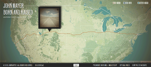
Shadow Days is an impressive Google Maps based application designed to promote John Mayer's new song Born and Raised.

Shadow Days allows you to watch an animated Street View movie of any journey within the USA. To create your own movie you just need to set a starting point and choose a destination. You can then choose to watch as the application animates through selected Street Views from your journey route or view Street View thumbnail images moving along the route on a Google Map.

As the movie plays you can listen to Mayer's new single Born and Raised.

Hat-tip: Street View Funny

Wednesday, April 11, 2012

The Map of Life


The Map of Life is an impressive attempt to map life on Earth.

Using the application it is possible to click on a Google Map and get a list of all the different types of bird, fish, reptile, amphibian or mammal that live in a set radius around that location. For example, if I click on my address the map returns a list of 168 different types of bird and 32 different types of mammal.

It is also possible to use the map to view the worldwide habitats of different species. If you enter the name of an animal species the map will shade in the areas of the world that the animal inhabits.

Friday, April 6, 2012

Startup Weekend Events on Google Maps


Startup Weekends are weekend meet-ups where entrepreneurs and aspiring entrepreneurs come together to share ideas, form teams, build products, and launch startups. The Startup Weekend Upcoming Events map displays upcoming events with the Google Maps API.

The initial map view shows the Startup Weekend events scheduled for the coming month around the world. A control in the map sidebar allows the user to change the month. When the user selects a different month from the sidebar the events for that month are automatically displayed on the map.

The map uses the Styled Maps feature of the Google Maps API to create map tiles that complement the color-scheme of the Startup Weekend website.

Thursday, April 5, 2012

How to Survive the Zombie Apocalypse


Map of the Dead is a handy Google Maps guide about how to survive the approaching zombie apocalypse.

Once you enter your address into Map the Dead you are presented with a Google Map that shows you the zombie danger zones around your home. The map also displays nearby places that are likely to have resources to help you survive once the zombies begin to take control.

It is highly likely that the internet will not survive the rise of the dead so you are advised to print out your personalised Map of the Dead and store it in a secure location.

Friday, March 30, 2012

Mapping the Fonts of London


London Typographica aims to photographically record publicly available lettering and type throughout London.

The London Typographica iPhone app allows users to take pictures of fonts that they find out on the streets of London and post them to a Google Map. The map itself is a wonderful guide to the fonts used in street signs, on shop-fronts and in graffiti around the capital city.

If you click on a map marker on the map the submitted photograph of a found font appears in the map sidebar.

Monday, March 26, 2012

Strange Strolling with Google Maps


The Strange Stollers is a team of hikers, currently in training for the Oxfam Trailtrekker 2012 challenge. Oxfam Trailtrekker is a 100km trek for teams of four, over 30 hours across the Yorkshire Dales National Park, and takes place 26th-27th May 2012.

The Strange Strollers Training Map is a Google Map being used to record and document the walks that the group are undertaking in their training for the Oxfam Trailtrekker.

Using the GPS tracks, captured with a Garmin Forerunner, the map shows the routes of the group's walks. Each walk contains map markers that reveal photographs taken on the walk, which have been imported with the Instagram API or Tweets that have been imported onto the map using the Twitter API.

Wednesday, March 21, 2012

New 3D Landmarks on Google Maps


Google has enhanced the quality of more than a thousand 3d landmarks around the world. The new 3d buildings are much more impressive than the basic outlines that they replace.

To showcase some of the best of the 3d buildings in Google Maps I've created a 3d View Slideshow. The slideshow animates through some of my favourite 3d views. The map also uses the Styled Maps feature in the Google Maps API to take away roads and other map features to help the 3d buildings stand out a little more.

Via: Google Lat Long

Tuesday, March 20, 2012

Commercial Real Estate on Google Maps


42 Floors is a nicely designed commercial real-estate Google Map.

Using the map it is possible to search for commercial properties by location, price and by size. Two slider controls allow the user to select the square feet and price range that they are interested in and the resulting properties are displayed on the map.

If the user clicks on a map marker they can get the full details about the property and even view it on Street View.

Wednesday, February 29, 2012

Barcelona's Mobile Friendly Websites Map


According to Google if smart-phone users have a poor mobile browsing experience 61% of them won't visit a website again. To coincide with the World Mobile Congress in Barcelona, Google have partnered with the Barcelona City Council to create Barcelona Go Mobile.

For the initiative Google helped businesses and landmarks in Barcelona optimise their websites for mobile phones. The Barcelona Go Mobile Google Map is a guide to mobile friendly websites in the Catalan capital.

The map allows users to search and find mobile friendly websites via a number of categories (culture, hotels, restaurants etc). If you click on a marker you can view screenshots of the selected website before and after it was optimised for mobile browsing. You can also click on the screenshots to visit the selected location's mobile website.

Via: Technomaps

Wednesday, February 1, 2012

Interactive Bus Stops on Google Maps


Bus-Tops is a very exciting interactive art project launching in London today. Thirty red and black LED screens have been installed on the roofs of bus shelters around London. Absolutely anyone in the world can create artwork and hopefully get a chance to see their work displayed on one of the screens.

If you want to view the submitted artwork then you will need the Bus-Tops Screen Locations Map. It allows Londoner's to find their nearest Bus-Tops screen. The map also uses the Google Maps Styled Maps feature to give the map an appropriate red and blank design.

Thursday, January 26, 2012

MetroCard Use Visualised on Google Maps


The Wall Street Journal created this great data visualisation to show how New Yorkers are using different kinds of MetroCards on the city's public transit network.

Examining MetroCard Usage uses the Google Maps API to present how the 30-Day Unlimited, Pay Per-Ride and Senior Discount MetroCards are used throughout NYC. Heat maps are created for each card type and useful information windows point out specific locations and usage of the cards that the WSJ finds interesting.

The visualisation also presents data taken after the 12/30/2010 fare increases to examine how usage of the different MetroCards may have changed after the fare rises.

Wednesday, January 18, 2012

Maps of SOPA & PIPA Supporting Senators


Spatial Situation has created two maps to show congressional support (and opposition) for H.R. 3261 (SOPA) and S. 968 (PIPA).

The Map of Congressional Support for PIPA shows which senators are known to support and which senators oppose PIPA. The Map of Congressional Support for SOPA shows known congressional supporters and opponents of the Stop Online Piracy Act (SOPA).

Both maps also include a pop-up form to contact your congressman about the two acts.

Friday, December 23, 2011

The SOPA Map


SOPA Map is attempting to map congressional supporters and opponents of the Stop Online Piracy Act (SOPA).

Known congressional supporters of the act are displayed on the map with a red map marker, opponents to the bill are indicated with a green marker. Each congressman's political allegiance is also displayed by colored polygons on the map.

The map also includes a pop-up form to contact your congressman about the Stop Online Piracy Act.

Popular Posts