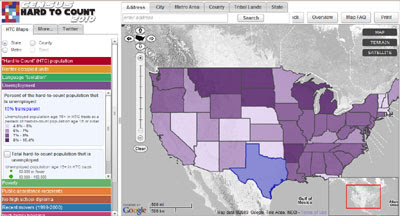
Today the City University of New York's Hard to Count map is being updated to show tract locations that will be receiving blanket and target questionnaire mailings.
The Hard to Count Google Map pinpoints census tracts that the U.S. Census Bureau considers difficult to enumerate, and displays detailed demographic and housing characteristics that the Census Bureau believes will create challenges to achieving an accurate count in certain communities. The site allows census advocates to tailor their activities and address specific barriers, such as language difficulties or low educational attainment.
Using the map you can type in a county and highlight the tracts below a certain participation rate (you can enter whatever rate you want). You can then sort the resulting list so you can see at a glance the highest and lowest performing tracts.
It is also possible to compare the 2010 rate map with the 2000 rate map and click on any spot on the map to display the latest participation rate for that area (state, county, or tract, depending on how close in or out you've zoomed).
The City University of New York have also posted an analysis of the first week of census participation rates at Urbanresearch.org.
_____________
0 comments:
Post a Comment